あい
PythonのSeaborn
を使って簡単な
ヒストグラムを
描いてみます
[PR]※本サイトには、プロモーションが含まれています
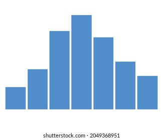
ヒストグラム(histogram)とは?
連続データの分布を
視覚的に表現するためのグラフ
縦軸を度数、横軸を各区間に分け
グラフを作ります
Seabornとは
Seabornは
Pythonのデータ可視化ライブラリの1つ
でMatplotlibをベースにしています
Matplotlibよりも
より美しい洗練されたグラフを
簡単に作成することができます。
あい
Seabornは
デザイン性の
あるものなんだね!
Seabornでヒストグラムを実装する
Seabornでヒストグラムを実装していきます
import seaborn as sns
import numpy as np
import matplotlib.pyplot as plt
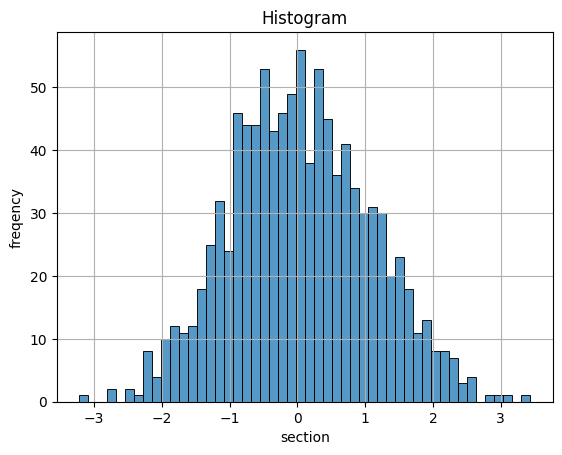
# 平均値 0,標準偏差 1, 1000個のデータを格納する
x = np.random.normal(0, 1, 1000)
# ヒストグラムをプロットする
sns.histplot(x, bins=50, kde=False)
# タイトルとラベルを入れる
plt.title('Histogram')
plt.xlabel('section')
plt.ylabel('freqency')
plt.grid(True)
# ヒストグラムをpng形式で保存する
plt.savefig('histogram.png')
plt.show()出力
で描いたプログラムと比べてみると
import seaborn as snsと
# ヒストグラムをプロットする
sns.histplot(x, bins=50, kde=False)
が変わっている所です
で作ったグラフを比較します
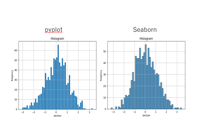
Seabornはグラフのデザインが
変わっていますね !