あい
今回はpythonで
一番簡単なヒストグラムを
実装してきます
[PR]※本サイトには、プロモーションが含まれています
目次
ヒストグラム(histogram)とは?
連続データの分布を
視覚的に表現するためのグラフ
縦軸を度数、横軸を各区間に分け
グラフを作ります
Matplotlibとは
Matplotlibとは
Pythonのデータ可視化ライブラリ
Matplotlib.pyplotを利用すると
グラフがpythonで簡単にかけます
ヒストグラムをpythonで実装する
一番簡単な
ヒストグラムのプログラムを紹介します
import numpy as np
import matplotlib.pyplot as plt

# 平均値 0,標準偏差 1, 1000個のデータを格納する
x = np.random.normal(0, 1, 1000)

# ヒストグラムをプロットする
plt.hist(x, bins = 50)

# ヒストグラムをpng形式で保存する
plt.savefig('histogram.png')

plt.show()
出力結果
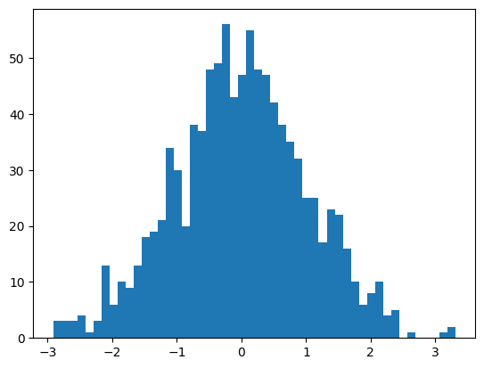
plt.histでヒストグラムを作成し
plt.savefigでヒストグラムを保存
plt.showでグラフを表示しています
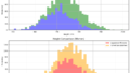
グラフにタイトルやラベルを入れる
グラフにタイトル、グリッド線、ラベルを入れる
コードを紹介します。
| コマンド | 意味 |
| plt.title(‘title_name’) | グラフタイトル |
| plt.grid(True) | グリッド線を追加 |
| plt.xlabel(’x_axis_name’’) | x軸のラベルを追加 |
| plt.ylabel(’y_axis_name’’) | y軸のラベルを追加 |
あい
さっきのグラフに
全部入れていきます !
import numpy as np
import matplotlib.pyplot as plt

# 平均値 0,標準偏差 1, 1000個のデータを格納する
x = np.random.normal(0, 1, 1000)

# ヒストグラムをプロットする
plt.hist(x, bins = 50)

# タイトルとラベルを入れる
plt.title('Histogram')
plt.xlabel('section')
plt.ylabel('freqency')
plt.grid(True)

# ヒストグラムをpng形式で保存する
plt.savefig('histogram.png')

plt.show()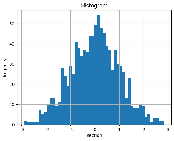
あい
全部搭載!
Binの幅の変更ヒストグラムにエッジをつける
plt.hist(x, bins = 50)binsは区間の数を
設定することが出来ます
さらにedgecolorという
要素を加えることによって
ヒストグラムの外枠にエッジを
実装することができます
plt.hist(x, bins = 75 , edgecolor='White')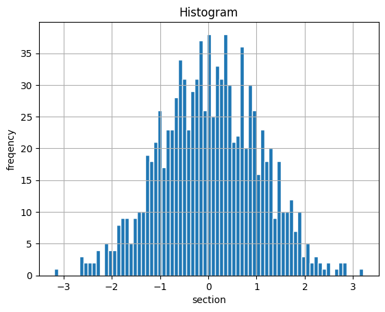
あい
bin数増えて
細かくなった!
完了です